Art direction: watercolour war, clay gun
Why the war is a watercolour map and the gun is soft clay, the styles tried first, and the games and painters Shellfall learns from.
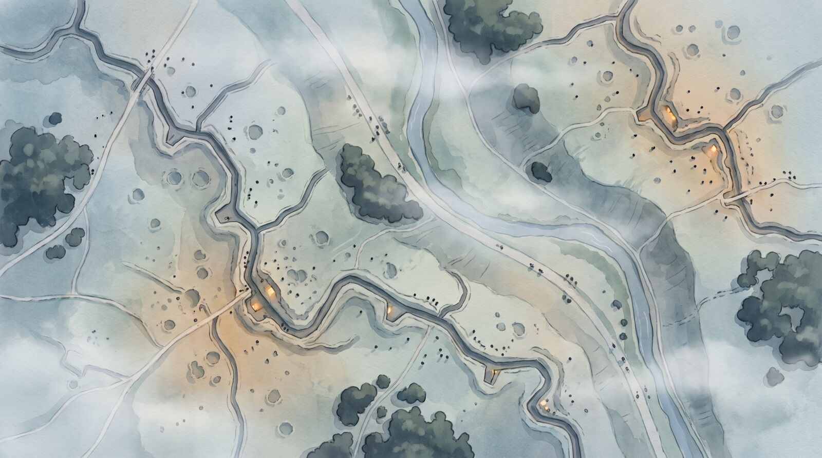
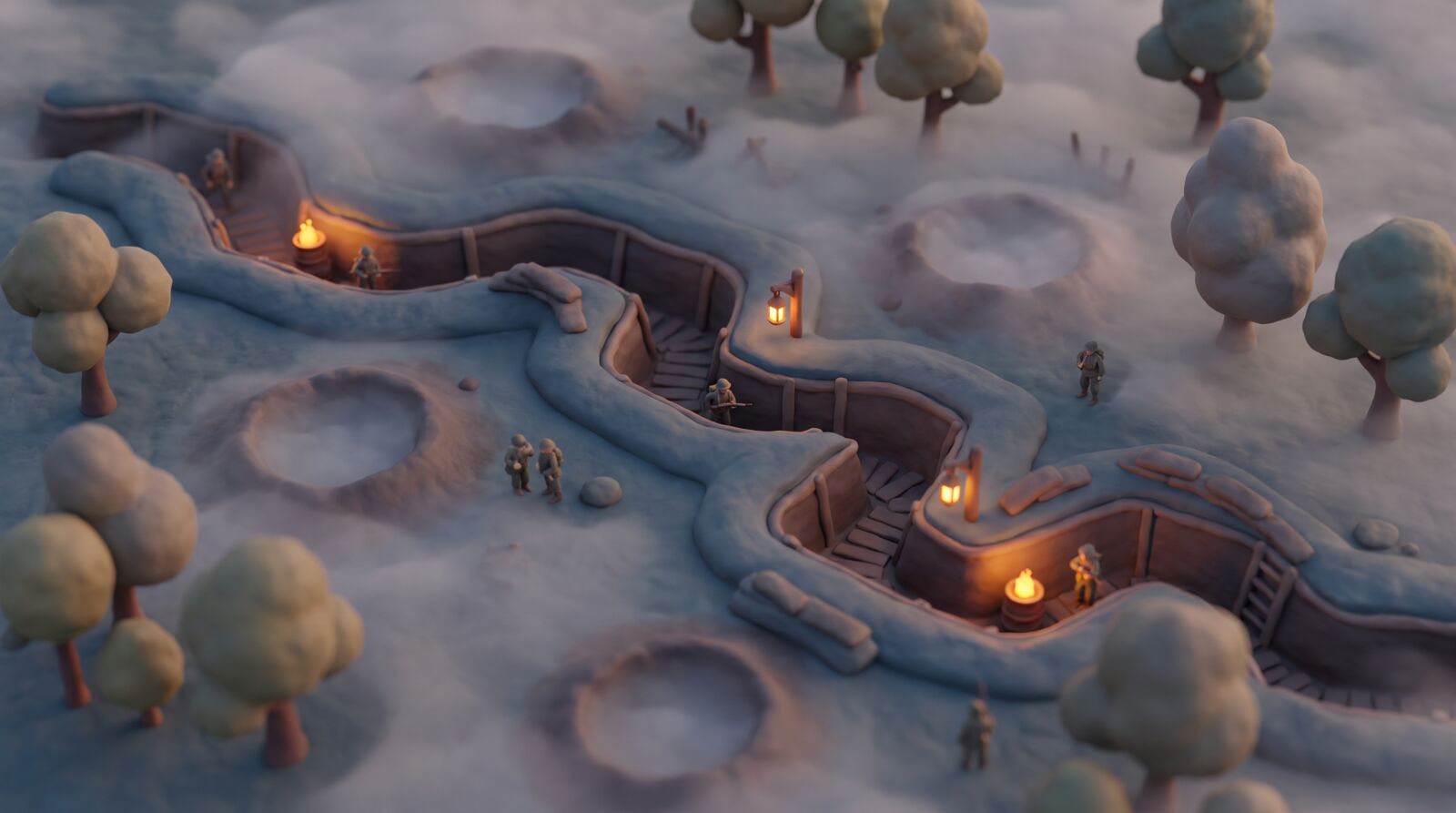
Shellfall uses two soft styles, never low poly, separated by distance. The war, seen from far above, is a watercolour and ink painting on paper. The only close-up, Old Marta on her siding, is soft matte clay. A band of clouds hides the switch between them. See The map table and the gun yard.
Why two styles
Watercolour reads as a map and a painting at once, so the Fog of war, recon and the intel map all live naturally in the same picture. Clay is kept for the gun alone. Up close, it makes soldiers look like toys, so the battlefield is never shown in clay.
The rules
- No low poly, no faceting. Smooth terrain and rounded forms everywhere.
- Real proportions, small scale. Soldiers are only ever seen from far above, 3–8 px tall. Nothing is modelled that the camera cannot see.
- Readability first. The three faction colours differ in lightness, not just hue, and every screen is checked in greyscale.
- Violence stays gentle. Soldiers fall and vanish in a small puff of smoke. Explosions are cream smoke rings with a peach core. No blood, no bodies.
- Warm lights mark people. Fog and ambient light are cold blue; the only warm points are lamps and fires, so the eye goes straight to people.
- Mist is not fog of war. Mist sets the mood and fills the trenches at dawn. Fog of war is information, drawn as blank paper with a pencil grid. One never stands in for the other.
Five styles, two chosen
Five smooth styles were rendered from the same brief: a bird's-eye trench battlefield at dusk, tiny soldiers, mist and warm lamps.
| Style | Verdict |
|---|---|
| A, tilt-shift miniature | Fits a high camera, but reads as a photographed model railway. Kept as a crowd-density reference. |
| B, soft painterly 3D | Very cozy, but the camera and soldiers drifted too close and cartoonish. |
| C, soft realistic, muted | The most atmospheric, but too grim for a cozy game. |
| D, matte clay | Chosen for the gun close-up only. |
| E, watercolour map | Chosen for the battlefield, the map and the fog of war. |
Style targets
Six concept frames are the targets for the first look test: three watercolour frames (W1 to W3: the battlefield, trench states and fog of war), two clay frames (C1 and C2: the gun yard and the cockpit) and the cloud transition (T1). A frame passes when someone who has not seen it can match an in-game screenshot to it at 1280 × 800. See Roadmap.
References
| Reference | What Shellfall takes |
|---|---|
| Dredge | Warm lights as safety in a cold, foggy world |
| Frostpunk | Warmth as status: a lit lamp shows what is held and ready |
| Manor Lords | A bird's-eye camera over many small, realistically proportioned people |
| Bad North | Diorama framing and tiny units |
| Tiny Glade | The soft, handmade feel the clay should carry |
| Paul Nash, We Are Making a New World (1918) | The dawn palette and the shapes of cratered ground |
| WWI trench maps and aerial photographs | The battlefield should read like a hand-coloured trench map |
About these pictures
The images on this page and across the handbook are concept frames, made with AI image tools (Higgsfield) during pre-production as mood targets. They are not the game. The final art is modelled in Blender and painted by the game's own renderer. See The Hearth engine.